Email Design
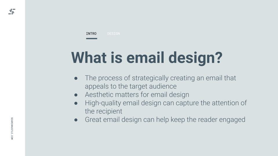
Email design is about strategically creating an email that appeals to the target audience. Aesthetics still matter in email design. A great email design will capture the recipient’s attention and help keep them engaged.
Aesthetics still matter in email design. A great email design will capture the recipient’s attention and help
keep them engaged.
Subject line:
The subject line is the first thing the recipient sees. It should provide a concise overview of what the email is about while also piquing interest. In short, the subject line (10 tips to writing a subject line) needs to make the subscriber WANT to open the email. After all, 47% of email recipients open emails based on the subject lines alone.
Preheaders:
The preheader is a preview of the email itself. It’s similar to the meta description of a website.
A preheader that’s done well will give context to the subject line and even improve open rates. Like the subject line, the preheader shouldn’t be too long. Ideally, it’ll be between 40-70 characters.
Color:
Any colors used within the email should match the brand’s color. Use experimentation to find out what colors work best with the content being delivered. Colors should help to grab attention and underline important parts of the copy.
Overall, avoid choosing too many colors as it can make it hard to concentrate on the content, but do use color as a means to direct attention.
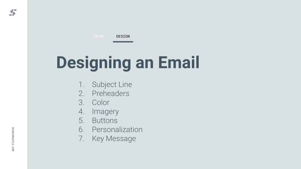
Imagery:
No one wants to open an email and be met with an overwhelming wall of text. Incorporate on-brand visuals like high-quality images, GIFs, and videos.
To ensure images remain high resolution and don’t become blurry, there are a few steps that need to be taken. Most emails are no wider than 640px. The image will need to be twice this size at around 1200px. Use image attributes and CSS to modify the image and keep it at the desired width.
Finally, make sure that any images used serve to complement the email, not distract from the message. It’s important that the images used aren’t generic stock images that don’t relate to the content itself, and also that the image-to-text ratio isn’t too unbalanced.
Buttons:
Well-designed buttons serve to draw attention to important action steps within the email. Having different button designs and colors for different priorities is a good idea.
For example, the CTA could be a blue button with white text. Then, a “register” or other secondary element button could be light gray with black text.
Keep in mind that less is always more. Like with any other element, there shouldn’t be so many buttons that it is distracting.
Since some email clients block images by default, avoid designing buttons as images. Instead, use a “bulletproof button.” This is a combination of HTML and in-line CSS. By designing the button this way, it will ensure that the button is rendered even if images are turned off.
Personalization:
Emails that use a personalized subject line are 26% more likely to be opened.
Studies have repeatedly shown that personalization not only increases customer engagement (Growing and Engaging an audience), but it can also generate 6x higher transactional rates.
Don’t think of emails as being one-to-many. Instead, think of every email as one-to-one and consider how to customize the content to each subscriber list.
Deliver the key message:
The saying “time is money” remains true, even for subscribers reading through an email. Content that rambles and fails to reach the point won’t engage the reader or convert leads into sales.

Ready to Take Your Search Hustle Further?