Design Principles and Copy
Design principles have been established through thousands of trial and error tests conducted over several decades. The combined knowledge and study of these early marketing campaigns have allowed us to develop a template for success. Following these design principles is essential, but there is still plenty of room for individualized solutions.

The first step in building an effective website is determining why you need one. What purpose does the website serve for the company? And how does it improve the marketing of the business? Understanding the answers to these questions is essential and serves as a starting point for the design.

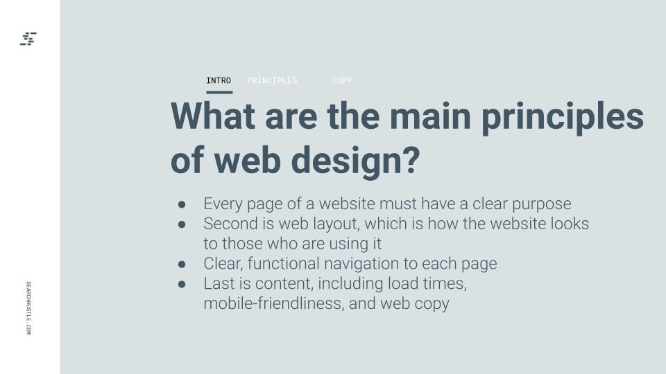
What are the Main Principles of Web Design?
While you can find lists of principles used in web design, the fundamental principles come down to a few simple steps. Producing high-quality, good-looking websites is no longer difficult, so don’t overwhelm yourself with art and cosmetic choices. While there is still value in these areas, adhere to the following core principles.
First and foremost is a clear and demonstrable purpose. Every page of a website must have a clear purpose. There is no reason to have extra pages or unusable links on your website; these only dilute the value of the content and waste the crawl budget.
The second is web layout, which is how the website looks to those using it. This covers structural points and artistic choices. A good web layout is easy for potential visitors to use, view, and understand.
The third is navigation. Just like it sounds, this is a principle that covers the usability of the website. Your website must be easy to use and have clear, functional navigation on each page.
Finally, content. Structurally, there are principles that govern the employment of content, such as load times and mobile-friendliness. There are also some design principles around web copy to consider that we will unpack soon.

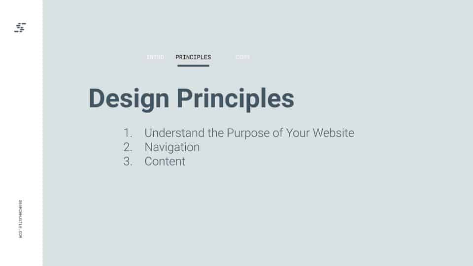
Understand the Purpose of Your Website
The first step in building an effective website is to determine why you need a website. What purpose does the website serve for the company, and how does it improve the marketing of the business. Understanding the answers to these questions is essential, and serves as the very beginning of website design principles.
Establish expertise
A website gives opportunities to establish expertise on a broad scale. Focusing on industry knowledge and sharing information must be a primary purpose of the website. Building up topical authority is essential to establishing a successful online presence.
Build your brand
Building up the business’s brand is vital to success in the digital space. A website allows you to reinforce and improve a brand’s image continuously. Make sure the website helps deliver a positive and unique brand image. The more this positive brand image stands out, the more successful you will be.
Generate leads
A website should take an interested person and build upon this, turning them from passive viewers into active customers. The website allows direct engagement of every potential customer, making leads easier to acquire. The most common way of doing this is to ensure a web form exists so the customer can fill in the required data and contact information.
Turn leads into sales
Turning a user’s interest into a sale is what generating leads is all about. Engaging with content and targeted advertisement can easily transition interest into purchasing or consumption. This is the final purpose of all marketing efforts and even the website itself.
Web layout
This area is more about the technical aspect of the website, how it looks and operates. A good web layout exists to guide visitors, leading them around the website. It is about the structural framework of the website which covers how information is presented and displayed.
Color
Information should be displayed in a color that contrasts well with the web page’s background. Dark colors on a light background are the most common, and this is for several reasons. It is easier for the eye to read the information displayed in dark text on a light background.
This doesn’t mean you may only use dark text on a light background, but make sure that you don’t use any colors that would strain a visitor’s eyes. Avoid bright, sharp colors like yellow and pink. You don’t want information washed out by the background.
Typography
The font is extremely important when it comes to readability, but also in appearance. A font should be professional, crisp, and clear. Any deviation from this can make your content appear less authoritative and difficult to read. There are some options but stick with a safe font.
Imagery
An image can be the most important element regarding a page’s layout and design. Most people are visually driven, and they scan and take in images before reading words. The images on a website must be clear, easy to view, and convey emotion and information.
Navigation
Navigation, as a design principle, means your website is easy to get around. There are no hidden pages or unlinked areas that can’t be accessed from the main or second-level pages. Don’t forget to add navigational menus to ensure viewers are even more successful on the website.
Every webpage should be navigable, from the blog to the service pages. This ensures viewers can find and engage with the content they want. Keep that in mind when a website design is proposed.
Optimized Content
Here are a few style choices to immediately improve how the web copy looks and works. Making the right choices and following the right principles can greatly affect results.
Here are a few style choices to immediately improve how the web copy looks and works. Making the right choices and following the right principles can greatly affect results.
Load time
One of the core measures of successful web content is that it loads quickly. This isn’t just for the sake of convenience, but it is measured by the webpage crawlers used by Google. If the content doesn’t load properly, or if it takes too long, the search engine will lower the rank of the website.
All pages and content on a website must load quickly and without issue. This is the only way to ensure that the crawler doesn’t experience a problem. It is also for the sake of viewers and potential customers, many of whom will be turned away if the website doesn’t load almost instantly.
Mobile-friendly
Around 50% of all web traffic is currently done by smartphones or other mobile devices. This is great news for businesses because many smartphone users can become customers. However, if a website is not mobile-friendly, it won’t be listed when a mobile search is made.
Make sure that the format and style of the website work with mobile platforms. Failing to do so cuts you off from half of the traffic and possibly more than half of the consumers you would reach otherwise. This would be considered a disaster for any business.
How do I optimize web copy?
Web copy is the act of publishing content online. Content that is published online can be helped by a few simple design principles. The real goal of content is to attract viewers and then turn those viewers into customers. That won’t happen if the content is hard to read or difficult to understand.
Here are a few style choices that can be made to immediately improve the way the web copy looks and works. Making the right choices and following the right principles can mean a big difference in the results achieved.
Headers
Headers are about more than convenience. They help organize text and allow readers to scan the information on a page. Accurate headers will also help improve the number of people that read the article. People want to see where the information they need can be found, and headers do that.
Bullet points
Bullet points can be effective at organizing information, and they also help emphasize important points. This sets aside what is on the list, drawing the eye and making the reader pay more attention, even if they are skimming through an article.
Bullet points and lists are valuable tools for any content creator. It takes a lot of effort to make effective content. So be sure to highlight the most important points using this formatting.
Short, concise paragraphs
A short, concise paragraph is easy to read. This can be difficult when detailing technical topics, but you must always make an effort. Try to limit paragraphs to three or four sentences to streamline the delivery.
Written content should be to the point and at the lowest possible level of reading requirement. This will make your content more accessible and easier to understand.
Highlight or bold key terms
Like bullet points, highlighting or bolding key terms catches a user’s attention. This can create a more curated experience for your readers. A good, concise article requires important information to be transmitted efficiently.
Highlighting or bolding key terms can also make it easier for readers to follow along with information. This makes the entire experience of reading content more rewarding and easier to understand. It also helps those who scan or skim content more easily see the important elements and points on a page.
Know your audience
It is important that the choices you make the consumption of content easier for your audience. In order to do that, you need to know who is consuming your content, and why. If you are posting incredibly complex articles but your audience is mostly laypersons, you aren’t going to get a good response.
The same is true in reverse, so make sure to tailor all of your content. This way the people who are reading it get the most value out of it. That will reflect better on the business, brand, and the webpage.

Ready to Take Your Search Hustle Further?


